MATTEO'S
Brand identity
The brief: Matteo’s is in need of new branding that showcases its brand values and appeals to its target market.
The restaurant is intimate and family friendly. We want to position ourselves as an upscale venue that also feels ‘homey’. Similar to Merivale venues such as ‘mimi’s’ and ‘Una Mas’ which are also located in Coogee. Also ‘Alphabet Street’ in Cronulla. The target audience is Eastern suburbs locals and young families.
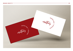
I went for a clean asethetic and handwritten feel to relate to Matteo's Bar and Kitchen. The handwritten font gives off a familial and warm vibe, inviting the audience to enjoy the rich food at Matteo's. The modern logo also represents the trendy and modern vibe of Matteo's known to the eastern suburbs.
 |  |  |
|---|---|---|
 |  |  |